Mobile-First Websites in India: Why It Matters for Your Business
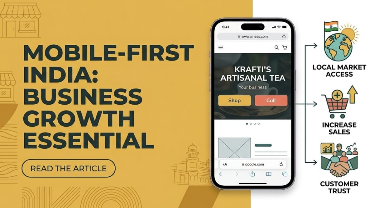
Is your website designed for desktop and "adapted" for mobile as an afterthought? In India, where 75% of internet traffic comes from phones, that means you're losing the majority of your visitors before they see your offer.
Signs your website is not converting
Visitors don’t take action
People read but don’t call, message, or book anything.
No clear next step
Visitors are confused about what to do after reading your site.
Too much text, low clarity
Your message is not clear in the first few seconds.
Weak trust signals
No proof, testimonials, or credibility to build confidence.
Why a website matters for local businesses
Is your website designed for desktop and "adapted" for mobile as an afterthought? In India, where 75% of internet traffic comes from phones, that means you're losing the majority of your visitors before they see your offer.
Warning: 40% of mobile users with a poor website experience go directly to a competitor. And since 2023, Google ranks the mobile version of your website - not the desktop version. A well-built mobile-first custom website ensures your site ranks higher and keeps visitors engaged.
Here's what mobile-first actually means in practice - and how to test right now whether you're losing customers to a broken mobile experience.
The India Mobile Internet Reality: Key Data Points
- 75% of all internet traffic in India comes from mobile devices (TRAI, 2025)
- 63% of Google searches in India are performed on mobile
- 53% of mobile users leave a website that takes more than 3 seconds to load
- 40% of users who have a poor mobile experience will go to a competitor
- India is the second largest smartphone market in the world by users
For a local Indian business - a clinic in Bhopal, a salon in Indore, a coaching center in Gwalior - the realistic assumption is that 7 out of 10 visitors to your website are on a mobile device. Your website is, functionally, a mobile app.
Contextual Next Step
Reading about Mobile Friendly Website In India?
The next useful step is to review the right service or review page.
What Mobile-First Actually Means (Not Just Having a Mobile Version)
"Mobile-first" doesn't mean your website has a mobile version. It means the website was designed and built starting from the mobile screen - and then adapted for larger screens, not the other way around.
The practical difference:
Not mobile-first (desktop-first): Developer builds a full desktop layout. Then adds CSS rules to shrink it down for mobile. Results in: small text, cramped buttons, horizontal scrolling, images that don't resize properly.
Mobile-first: Developer designs for a 375px-wide screen first. Text is readable. Buttons are large enough to tap with a thumb. Images resize correctly. Content is prioritized for a small screen. Then the layout expands gracefully for tablet and desktop.
Every website I build is mobile-first by default. The mobile experience is designed first, and desktop is the enhancement.
Before vs after the right website structure
Before
- Unclear homepage message
- No visible doctor or business trust
- No appointment or WhatsApp path
- Visitors leave without contacting
After
- Clear service and specialisation
- Trust section visible in seconds
- WhatsApp or call button on every page
- More enquiries from the same traffic
Don’t guess what your website needs
Understand what your website actually needs before you spend more money.
Direct team. Clear next step.
Website pricing bands to compare before hiring
Starter enquiry website
INR 30,000 - INR 30,000
- 5-7 pages website
- Mobile responsive
- Basic SEO setup
Growth website
INR 30,000 - INR 56,000
- 8-12 pages website
- WhatsApp integration
- Advanced SEO setup
Advanced website system
INR 56,000 - INR 2,00,000+
- Custom design & features
- Booking / enquiry system
- Ongoing support
How Google's Mobile-First Indexing Directly Affects Your...
Since 2023, Google uses exclusively mobile-first indexing - meaning Google crawls and ranks the mobile version of your website, not the desktop version.
This has a direct consequence: if your desktop website has detailed service descriptions but your mobile version shows truncated content to save space, Google indexes the truncated version. Your rankings reflect your mobile content quality.
A website that looks great on desktop but has a poor mobile experience will rank lower than a mobile-optimized competitor with equivalent content. This isn't a future concern - it's the current reality.
How to Test Your Website's Mobile Experience Right Now for Free
Quick test (30 seconds): Open your website on your own smartphone on a 4G connection (not WiFi). Ask yourself: Is the text readable without zooming? Can I tap the phone number with my thumb? Does the page load in under 3 seconds? Is there any horizontal scrolling?
Google's official test: Visit search.google.com/test/mobile-friendly and enter your URL. Google will tell you exactly what's wrong.
PageSpeed Insights: Visit pagespeed.web.dev. Your mobile score (out of 100) tells you how Google rates your mobile performance. Below 70 is hurting your business. Below 50 is a serious problem.
The 5 Most Common Mobile Problems Destroying Indian Business...
1. Text too small to read: Text under 16px is nearly unreadable on mobile. Most Indian websites use 12-14px body text designed for desktop.
2. Buttons too small to tap: A button smaller than 44x44 pixels is difficult to tap accurately on mobile. Contact buttons and CTAs especially must be large and clearly spaced.
3. Images not resizing: Images with fixed pixel widths overflow the screen on mobile, causing horizontal scrolling - one of the worst mobile UX patterns.
4. Phone number not clickable: Your phone number should be a tel: link so users can call with one tap. Displaying a number as plain text forces manual dialing.
5. Slow loading on 4G: Most Indian mobile users are on 4G (not 5G). An unoptimized website that loads in 1.5 seconds on WiFi might take 5-8 seconds on 4G. Every second of delay costs visitors.
Recommended guides
FAQs About Mobile Friendly Website In India
My website has a separate mobile version - is that good enough for Indian users?
A separate mobile version (m.yoursite.com) is an older approach that creates duplicate content issues for Google and is harder to maintain. Modern mobile-first responsive design means one website that works on all screen sizes - no separate version needed.
Does my Indian business website need to look the same on mobile and desktop?
No - and it shouldn't. Mobile layouts prioritize different things: larger text, stacked columns instead of side-by-side, prominent call buttons, and simplified navigation. A good mobile-first design feels native to the phone, not like a shrunken desktop website.
My customers are mostly older and use desktop - does mobile still matter for my Indian website?
Even if your primary audience skews older, Google still uses the mobile version of your website for ranking. Poor mobile performance will hurt your search visibility regardless of your audience's browsing habits.
How do I know if my Indian business website is truly mobile-first?
The simplest test: open it on a mobile phone with 4G (no WiFi) in an incognito window. If you find yourself pinching to zoom, squinting at text, or struggling to find the contact button - it's not mobile-first.
Does a mobile-first website cost more to build in India?
No - modern web development best practices treat mobile-first as the standard approach, not a premium add-on. If a developer charges extra for 'mobile compatibility,' that's a red flag about their development practices.

Dhiraj Kumar
Founder, DhirajWeb Agency
I help local businesses build conversion-focused websites with clearer trust, structure, and enquiry flow.
View all guidesReady to turn your website into a lead system?
I'll help you choose the right next step before you spend more.